Ambient Lighting Colors Q&A | CarInteriorMix
Ambient Lighting Colors Q&A: Ask the Community
Ambient lighting is one of those car interior upgrades that seems simple? until we start talking about color. Then it turns into a full-on community debate: ?Blue is too cold,? ?Red is too aggressive,? ?White looks cheap,? ?Purple is perfect,? ?No?purple is a nightclub.? And honestly? We love that for us.
So let?s make this a hangout, not a lecture. If you?ve ever changed your ambient lighting three times in one week because your mood shifted (or because your passenger had opinions), you?re in the right place. Below are a few popular color directions we see across our community, plus the pros, the ?ehh, maybe not,? and who each one tends to work best for.
As you read, don?t worry about being ?right.? Ambient lighting is personal?like wheel choices, tint levels, and whether brushed aluminum trim is classy or ?too 2012.? Let?s talk it out.
1) Cool Blue / Ice Blue: The ?Modern Tech? Favorite
Why we love it: Blue is the go-to for a clean, futuristic vibe. It makes the cabin feel crisp and organized, especially paired with black interiors, silver trim, and minimalist dashboards. It also plays nicely with digital clusters and infotainment screens.
Pros:
- Feels modern and ?OEM+? in a lot of cars
- Pairs well with black/gray interiors and cool-toned accents
- Great for nighttime highway cruising mood
Cons / debates:
- Some people find it too sterile or ?hospital-ish?
- If it?s too bright, it can reflect on windows and feel distracting
Works best for: Drivers who want a calm, tech-forward cockpit and prefer subtle ambiance over bold personality.
Community voice: ?I set mine to ice blue because it matches the digital cluster perfectly. My friend says it looks like a gaming PC on wheels? I?m not offended.?
2) Warm White / Soft Amber: The ?Luxury Lounge? Look
Why we love it: Warm white or amber feels expensive when done right?think premium lounge lighting rather than bright overhead LEDs. It can make the interior materials (leather grain, stitching, wood trim) look richer and less harsh.
Pros:
- Feels classy and understated
- Easier on the eyes for long night drives
- Highlights textures and trim without screaming for attention
Cons / debates:
- Some people say it?s ?boring? compared to color options
- Too yellow can feel dated if it?s not the right shade
Works best for: Anyone chasing a premium, relaxed vibe?especially with tan interiors, wood accents, or a more ?executive sedan? feel.
Community voice: ?I tried purple for a week, then went back to warm white. My car isn?t a club?it?s my decompression chamber after work.?
3) Red: The ?Sport Mode? Statement
Why we love it: Red ambient lighting can make the cabin feel focused and performance-driven, like you?re in a cockpit. It?s a bold choice that often matches red stitching, sport seats, and aggressive interior trims.
Pros:
- High-energy, sporty, and dramatic
- Looks great with black interiors and red accents
- Some drivers find it less distracting than cooler tones
Cons / debates:
- Can feel intense on long drives if it?s too saturated
- Not everyone loves the ?always angry? vibe
Works best for: Enthusiasts with sport trims, performance builds, or anyone who wants their interior to match the car?s attitude.
Community voice: ?Red at 20% brightness is perfect. Red at 100% looks like I?m about to launch a missile. Balance matters.?
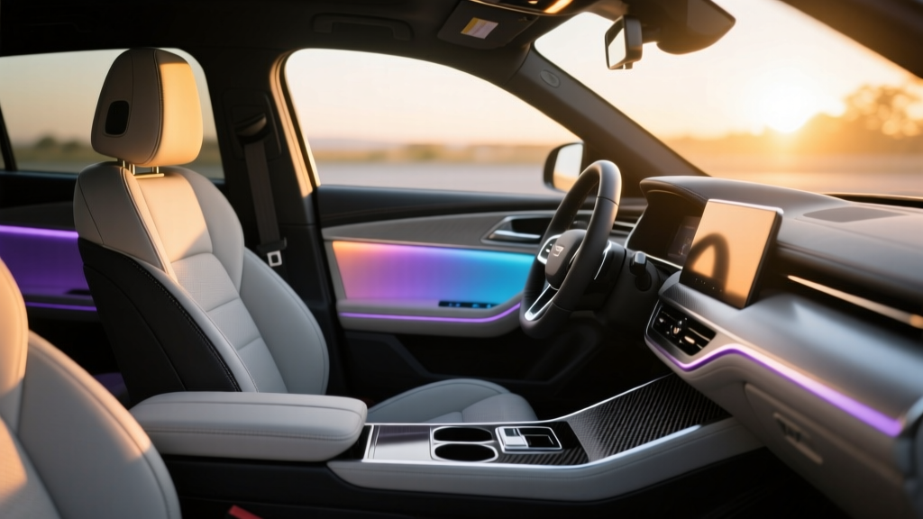
4) Purple / Magenta: The ?Tasteful Custom? (or ?Too Much?) Debate
Why we love it: Purple is the community wildcard. When it?s a deep violet at low brightness, it can look surprisingly upscale and unique. When it?s bright magenta, it?s? memorable. This is where our comment sections usually get spicy.
Pros:
- Unique, expressive, and not as common as blue/red
- Can look premium when dimmed and paired with black interiors
- Fun for meets, photos, and ?this is my car? personality
Cons / debates:
- Easy to push into ?club lighting? territory
- Some shades clash with interior materials (especially tan/brown)
Works best for: Drivers who like custom vibes and don?t mind a little attention?or who tweak brightness and shade until it looks refined.
5) Color-Cycling / Multi-Mode: The ?One Car, Many Moods? Approach
Why we love it: Some of us can?t commit?and we shouldn?t have to. Color-cycling setups or presets (Cruise, Night, Sport, Chill) let you match the mood, the music, or even the weather. It?s also great if different drivers share the car.
Pros:
- Maximum flexibility and personalization
- Fun for passengers and car meets
- Easy to find your ?signature? over time
Cons / debates:
- Some people think cycling colors looks cheap or distracting
- Too many options can lead to constant fiddling
Works best for: Anyone who loves changing their setup often, shares the car, or wants different vibes for commuting vs. weekend drives.
Quick Poll: What?s Our Go-To Ambient Color?
If you had to pick one for the next month, what are you choosing?
- A) Cool blue / ice blue
- B) Warm white / amber
- C) Red
- D) Purple / magenta
- E) I rotate colors depending on mood
Discussion Prompts (Let?s Hear It)
- What brightness level are you running?low glow or full neon?
- Do you match your ambient lighting to your interior (stitching/trim) or your exterior paint?
- What color looks best in photos vs. best in real life?
- Big debate: Is color-cycling fun? or tacky?
Now it?s your turn?drop your ambient lighting color (and your car/interior combo if you want) in the comments. Bonus points if you tell us what you tried first and why you switched. We?re building a real-world cheat sheet here, one opinion at a time.
So what do you think: are we team ?subtle and classy,? or team ?make it a vibe,? and what color are you defending today?